At Steele Consulting, we strive to use technology to create a product that will help our customers grow their business. We pursue excellence in every part of our projects, and one of the most overlooked aspects of a project’s design is color. To get some better insight in color and other aspects of UI/UX, Steele Consulting has been investing in and hiring people with more artistic backgrounds.
This post will be the first in a series of many posts compiling all the tools and information you’ll need to pick colors for your app or website design.
After reading this, you’ll have a better understanding of the meanings of individual colors, as well as some good examples of how to use each color in a website.
Red
Red generally stands for passion, love, anger, warmth, and boldness.
Light red stands for love, joy, and sensitivity.
Dark red stands for anger, boldness, and leadership.
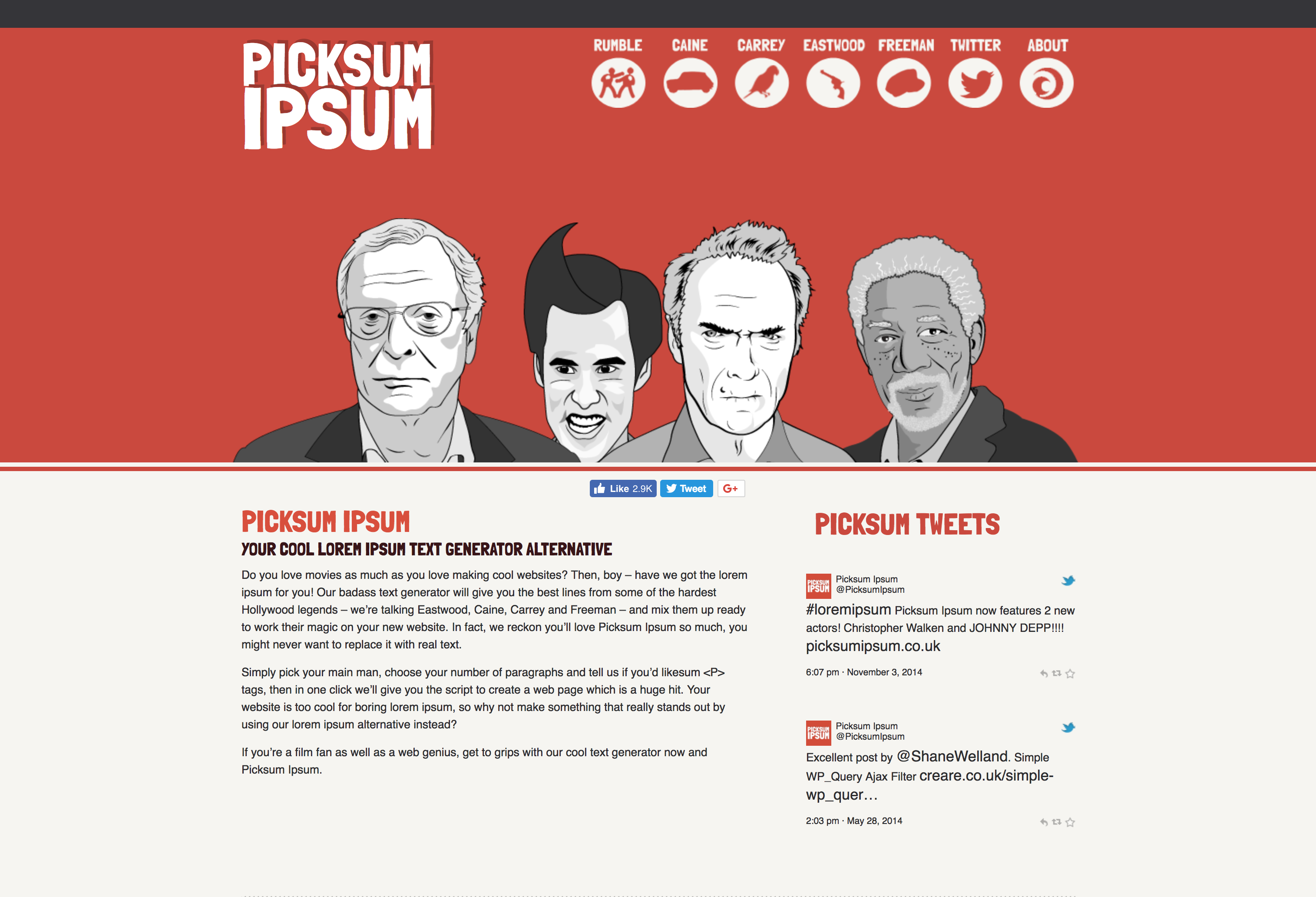
Website: http://www.picksumipsum.co.uk/
Picksum Ipsum uses red in a very creative way. While red can have a tendency to take over, their use of red in their homepage banner contrasts with the gray figures and white icons to highlight them. They use it for a nice bold banner at the top, and then they carry it throughout the page in their header text and accents. If they’d used it any more extensively, it would’ve made the page too overwhelming, but they knew when to stop, which makes their website a great example of how to properly use red in your website design.
Orange
Orange generally stands for enthusiasm, sunshine, energy, and inspiration.
Light orange/gold stands for wealth
Dark orange stands for rusticity, autumn, Halloween, and burning.
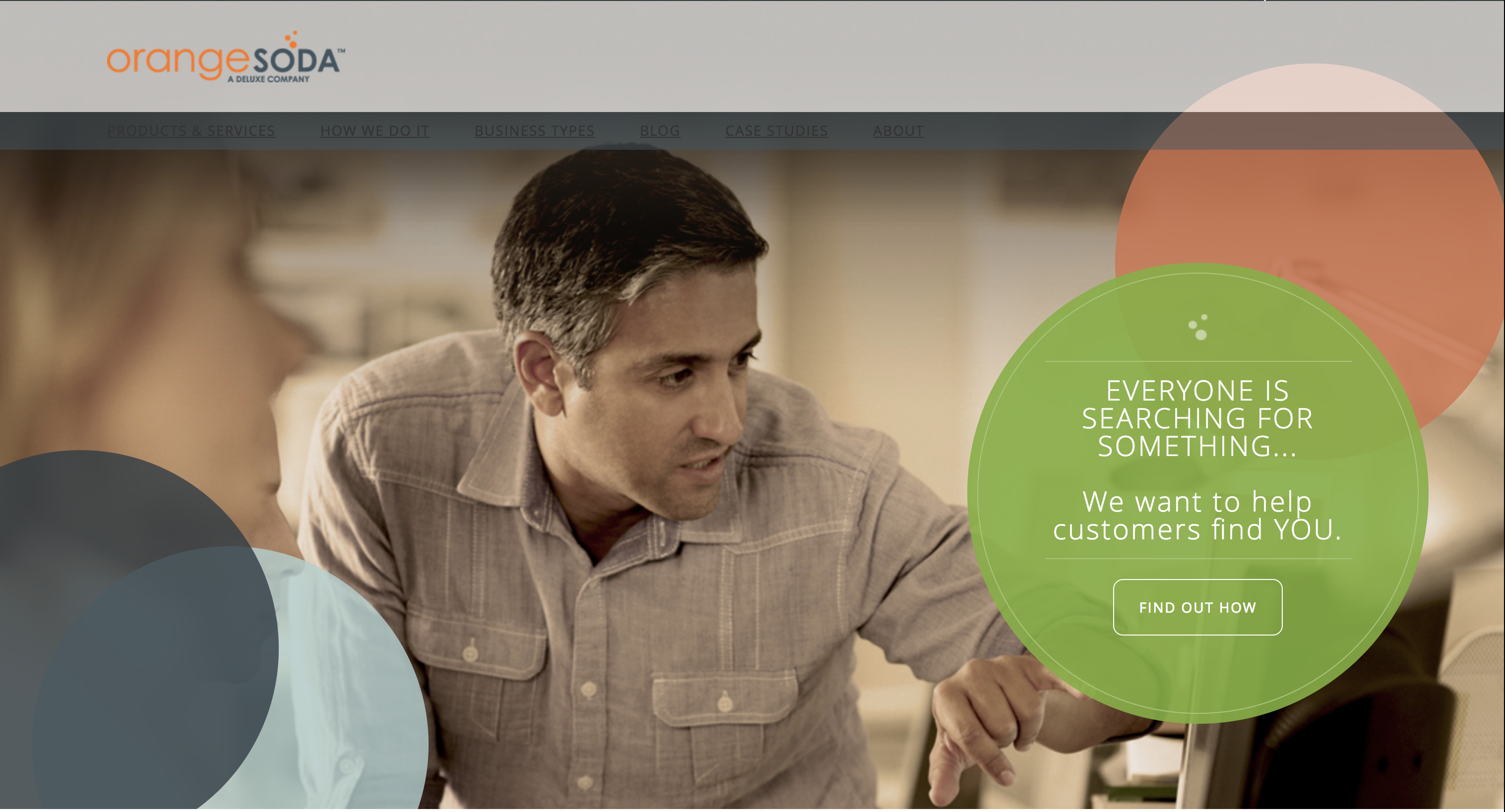
Website: https://www.orangesoda.com/
OrangeSoda, as a marketing company, utilizes the inspirational, enthusiastic, and energetic aspects of orange. They use these qualities to communicate to their customers that they’ll not only effectively and efficiently promote a business or product, but that they’ll also be a joy to work with. They contrast the orange with a soft blue/gray, which is really smart because orange and blue are complementary colors (they are on opposite sides of the color wheel), and they use the gray to tone the blue down to keep the page from being too puerile or childish.

Yellow
Yellow generally stands for joy, energy, optimism, and summer.
Light yellow stands for
Dark yellow/ocher stands for
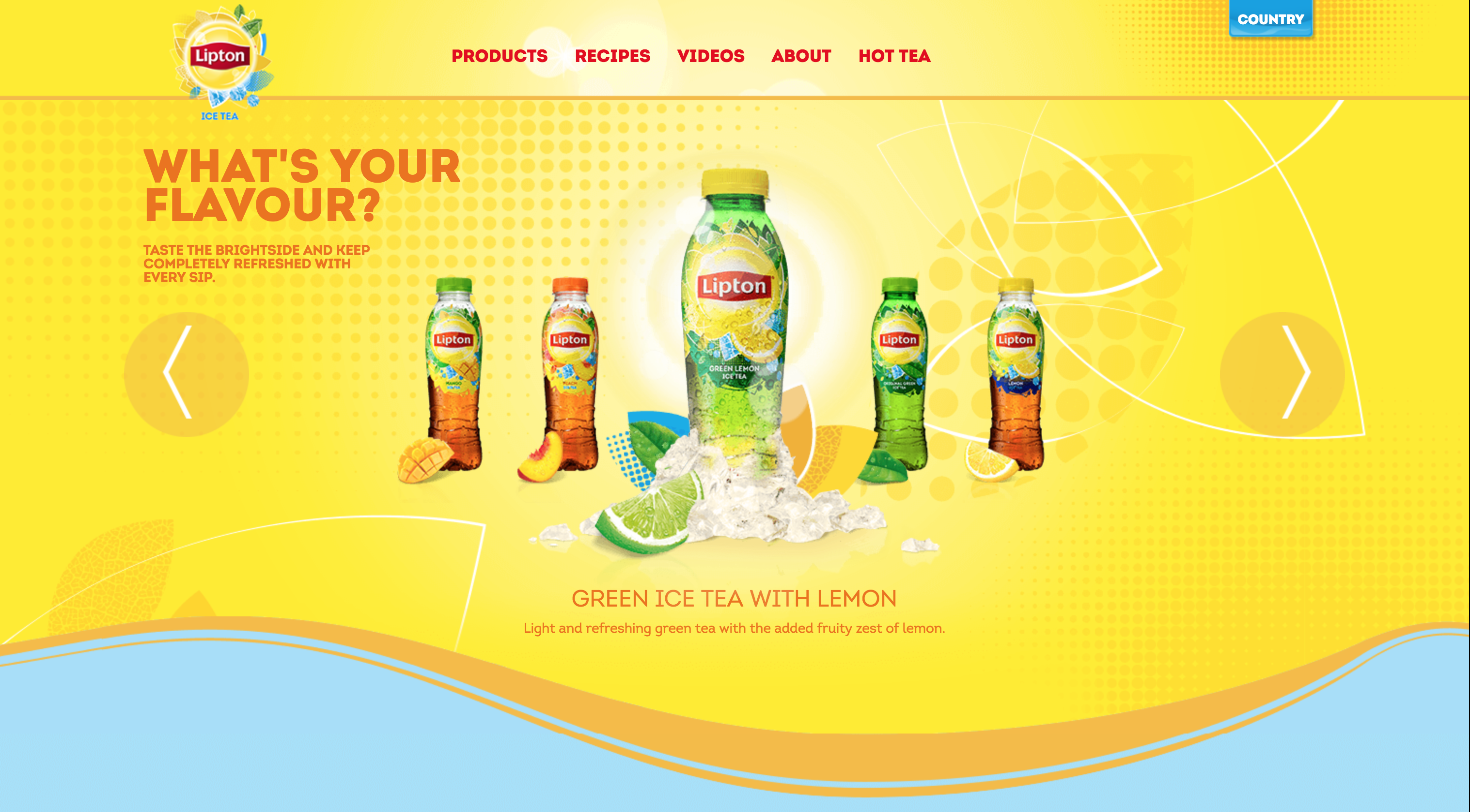
Website: http://www.liptonicetea.com/EN-Global/#videos
Lipton’s ice tea website employs the aestival, summery characteristic of yellow – sunshine, citrus fruits, etc. – to curate a thirst for a refreshing sip of zingy iced tea. Since yellow is a more mild color, they use it generously in their logo, navigation bar, section backgrounds, and even in some of their photos. They pair the yellow with red, orange, and green, which are all significant colors in the food industry and they’re reminiscent of citrus fruits. This website is a great example of using yellow in the food & drink industry.
Green
Green generally stands for harmony, creativity, sports, money, nature, environment, spring, and life.
Light green stands for youth, freshness, and immaturity
Dark green stands for ambition and greed
Website: https://www.ateliergymnase.com/
Gymnase is a screen printing workshop/art warehouse rental company, and their creativity really shows through their use of green on their website. They use a bright minty green with prudence, proving that less can be more. They mainly use this minty green for important text, borders, and dividers, and they use it for their submission button in the top right corner to let their CTA stand out more than anything else. Paired with the parallax and colorful photos throughout the site, Gymnase uses green to create an atmosphere of youth and inspiration.
Blue
Blue generally stands for calmness, depth, loyalty, trust, honor, and coldness.
Light blue stands for peace and health
Dark blue stands for knowledge and integrity
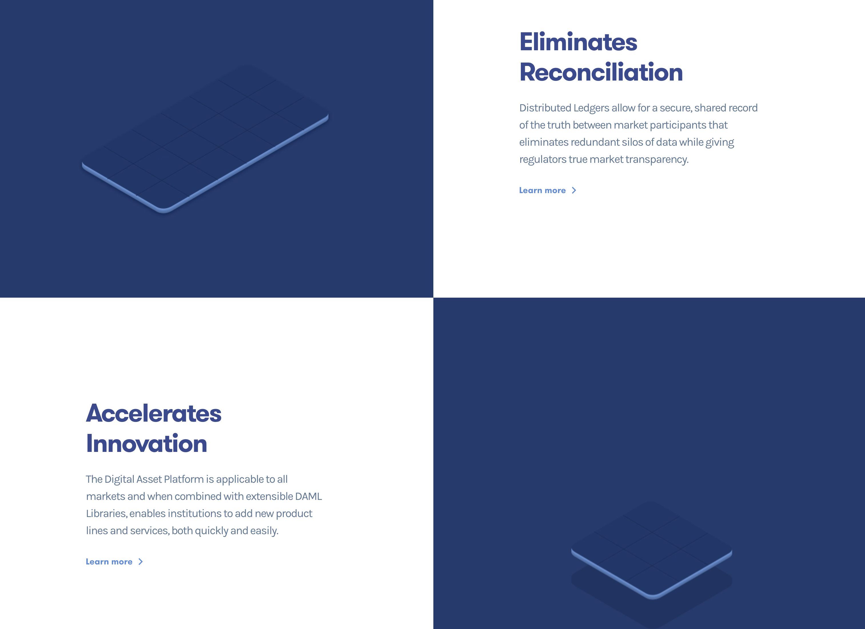
Website: https://www.digitalasset.com/
The Digital Asset website has a tiled layout that pairs a rich navy with white to create contrast and an atmosphere of professionalism. They even go so far as to incorporate the blue in their blog posts to maintain consistency throughout their website, and this uniformity hints at integrity. Blue creates a tone of trust, and since Digital Asset is a finance company that deals with sensitive data, it made an excellent choice for their website design.
Purple
Purple generally stands for luxury, relaxation, royalty, extravagance, wisdom, and magic
Light purple stands for sweetness, peace, and nostalgia
Dark purple stands for gloom, night, frustration, and sadness
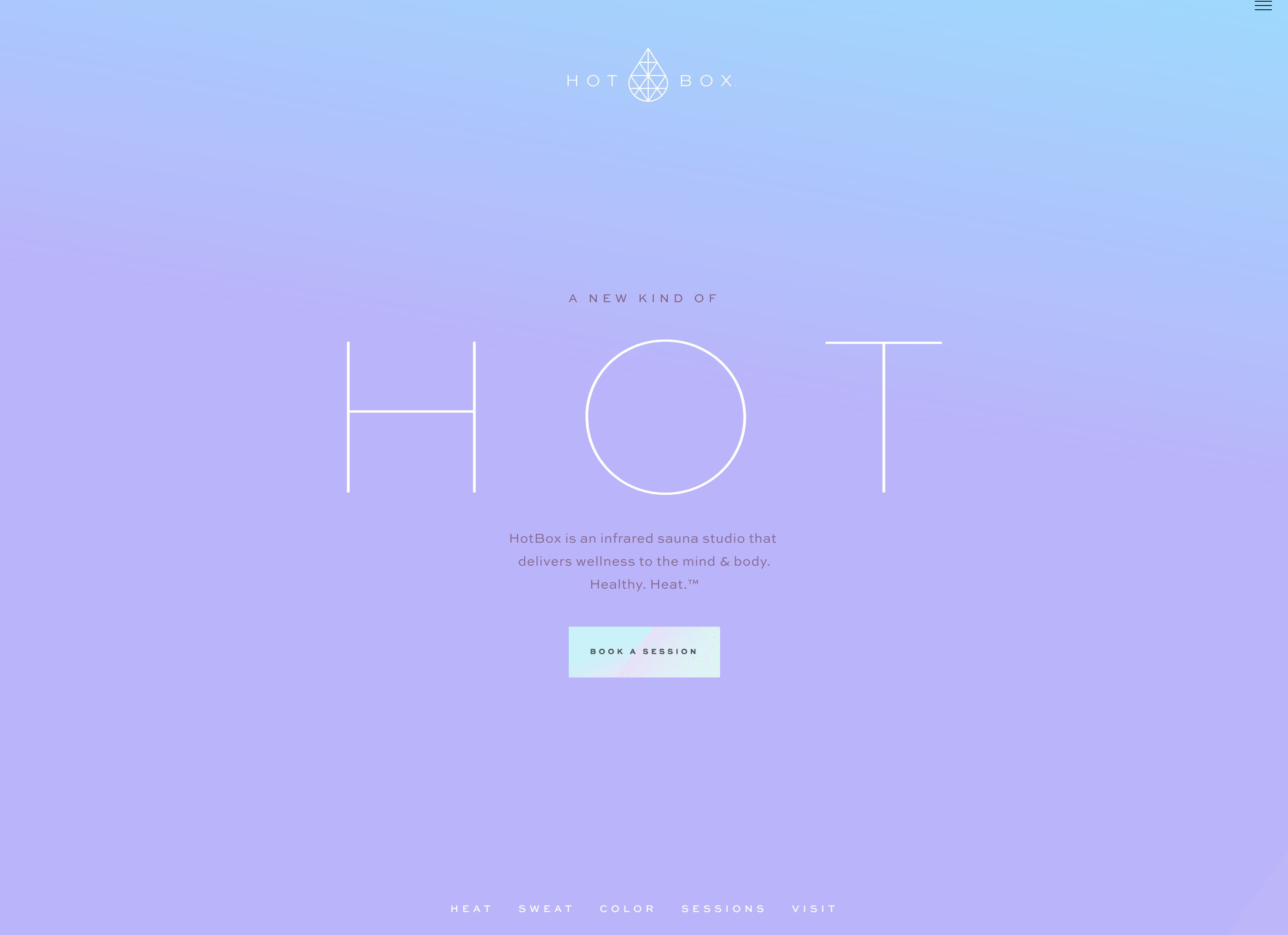
Website: https://hotboxsaunastudio.com/
HotBox’s cool, lavender tones create an immediate sense of peace as soon as the page loads. They’ve really done a good job of using the relaxing effect of purple to draw users to their sauna service. As you scroll, the ombre background transitions to a warmer, peach-to-mauve background which provides great ambience for their “Heat” section. Overall, their use of purple cultivates relaxation and rejuvenation, driving customers to book a sauna session.
Pink
Pink generally stands for love, romance, friendship, innocence, silliness, and femininity.
Light pink stands for gentleness, lightheartedness, cuteness, and immaturity
Dark pink stands for confidence and energy
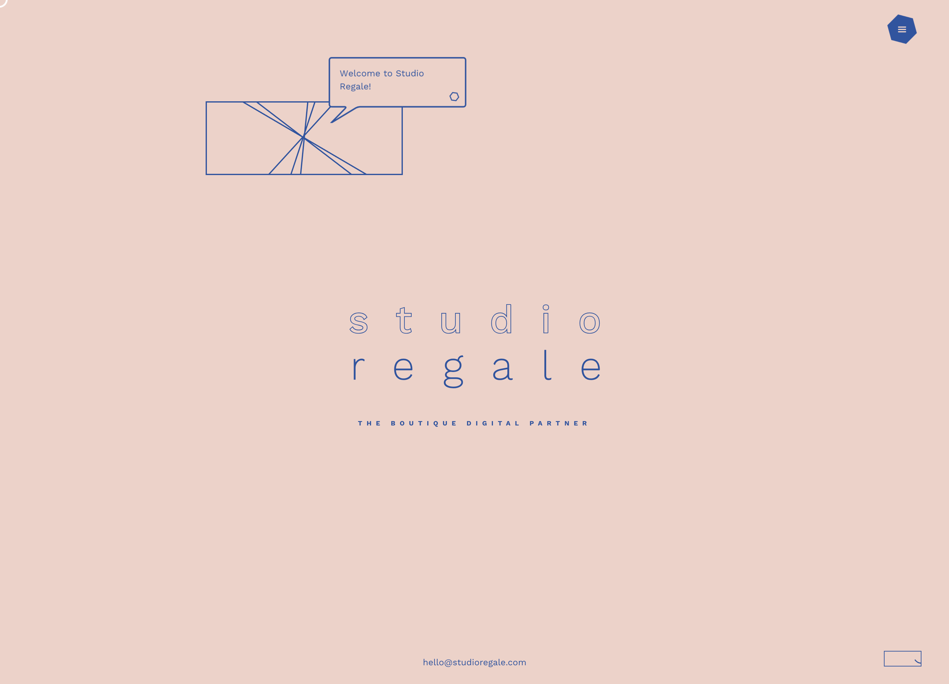
Website: http://studioregale.com/
Studio Regale uses a pale, soft, rosy pink that emanates innocence and funness. They also use some soft music and sound effects in the background when you interact with the site. Because this site is so interactive, the pink they chose is brilliant because they have little silly, cutesy messages that pop up, such as “You know you can explore right?”; this website does an excellent job of utilizing the gentleness and silliness of pink.
White
White stands for light, innocence, purity, cleanliness, sterility, winter, ethics, and perfection.
Website: https://paktastudio.com/
PAKTA does a great job of using white to make their products stand out. Instead of just having a bland, colorless site, they use white to contrast with the photos of their studio and project, which gives you a better picture of the business and real people behind the website. Their banner does a great job of showing the relationship and contrast between white and black. They also use white to reinforce their environmental awareness and ethics. Overall, PAKTA uses white in an exemplary way throughout their website.

Brown
Brown generally stands for craft, relaxation, casualness, reassurance, coziness, liquor, earthiness, and genuinity
Light Brown stands for honesty and reliance
Dark brown/umber stands for sadness, fatigue, and maturity
Website: https://firstsipbrewbox.com/
First Sip Brew Box plays well on the images of craft and liquor that the color brown portrays. They integrate the concepts of beer and delivery by choosing a cardboard background image, reiterating the idea that they can deliver beer to your doorstep. Although brown is one of the most disliked colors, First Sip Brew Box does an excellent job of using it in a classy way.

Black
Black stands for dominance, boldness, power, death, strength, sophistication, and elegance.
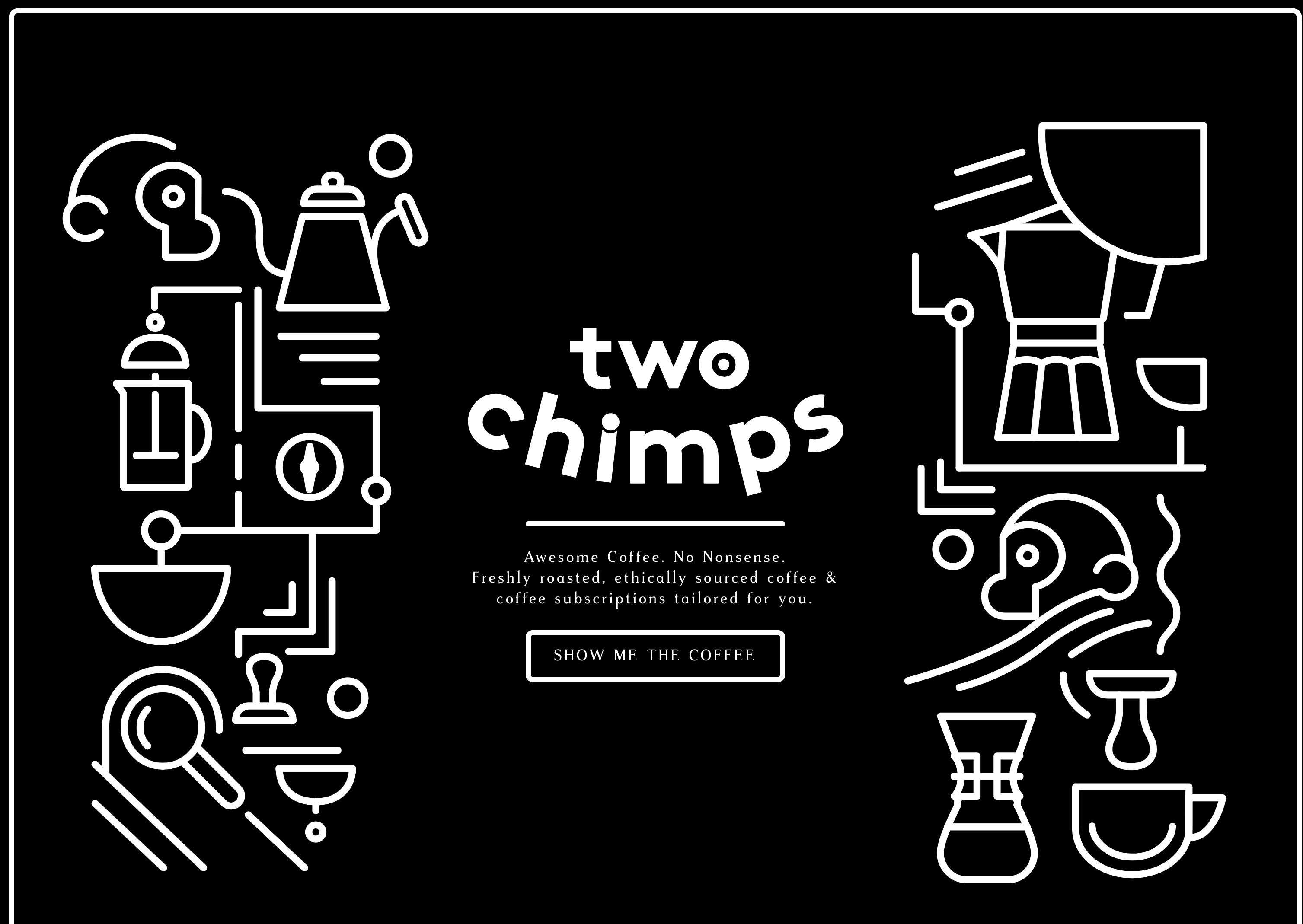
Website: https://twochimpscoffee.com/
Two Chimps does an amazing job of using solely black with white accents without making the site boring. As soon as you load the page, a black background draws attention to some animated, minimalist, white graphics. At the bottom of the homepage, they use the boldness of black to emphasize the words “Ready for greatness?”, which also plays well into the ambitious strong nature of black – and under that, it talks about tailoring a coffee subscription, which goes with the elegance and sophistication of black. Two Chimps uses black to create an atmosphere of service and class, which makes it a great example of how to use black in web design.
Gray
Gray generally stands for dullness, modernness, neutral, experience, sophistication
Light gray stands for calmness and enlightenment
Dark gray stands for mystery, formalness, organization, and suppression
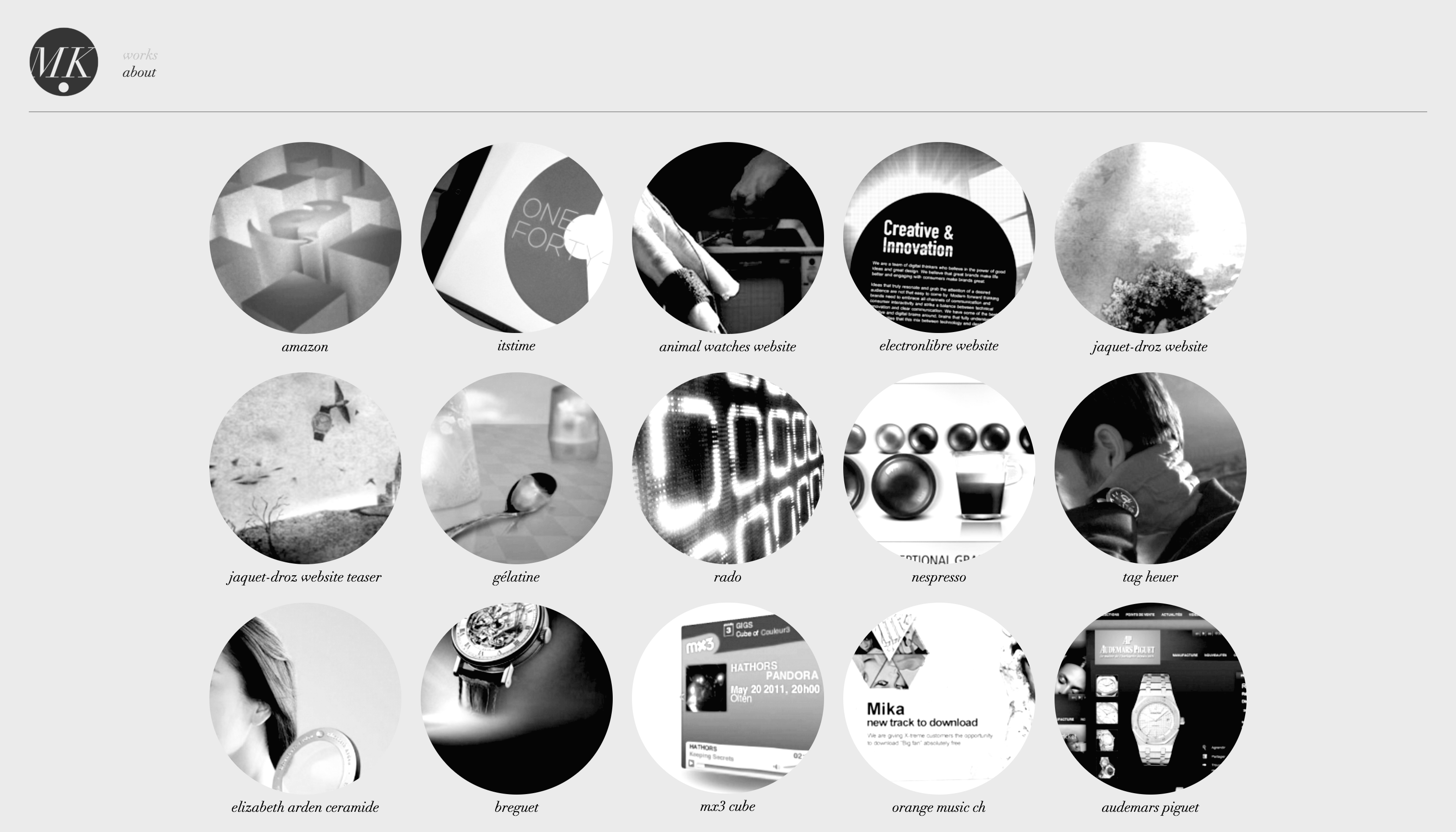
Website: http://dotmick.com/
Dotmick uses gray in one of the only ways gray should ever be used – to draw attention to color. Their homepage is a simple grid layout of round images that are initially in black and white, but when you hover over them, they’re colored and they stand out from all the other images. Accompanying the pop of color is a gray animation that borders the image and gives even more definition to the contrast and saturation of the photo.
When used correctly, each of these colors can have a great effect on your design and really make you stand out from the crowd. If you’d like to keep up with this series to get more tips, tools, and advice regarding color and design, as well as other developer insights, follow us on Twitter to get notified of new posts.